The way we work has changed significantly in recent years, with more people working remotely and virtually. As a result, UI UX trends have also undergone a significant transformation. It is crucial for UI UX practitioners to stay up-to-date with these ever-changing trends, learn from good examples of UX design, and replicate them. This article will delve into the top 17 UI UX trends for 2023, explore what is driving the trend change, and explain why it is essential to keep up with these new trends.
The field of UI UX is constantly evolving, and in order to achieve success, it is important to stay on top of the latest trends. The approach to UX design in 2024 will be different from the past, with significant changes expected, such as improved personalization based on artificial intelligence and a greater focus on user experience and accessibility.
Whether creating a website, app, or other software, design is a crucial aspect that must resonate with the customer. It conveys the main idea of the product, determines people’s attitudes, and shows concern for the user. Designers use it to connect the virtual and real world, adding 3D and immersive scrolling, among other features.
In this article, we will take a closer look at the UI UX trends of 2024, which will help businesses, thrive in the future.
What is UI/UX design?
UI/UX design is the art of creating digital experiences that captivate and simplify. It’s the magic behind user-friendly interfaces and trendsetting interactions. Dive into the world of UI UX trends, where every click tells a story, every color choice matters, and every trend shapes the digital journey.
Top UI UX Trends
Dive into the future with UI UX trends! Uncover seamless interactions, captivating AR/VR experiences, and personalized interfaces in 2024.
Dark Mode
The increasing popularity of dark mode is changing the way we view user experience, as more people rely on smartphones and laptops. We all love to Search in Dark theme on Google, don’t we?
A dark theme UI displays the surface areas in a dark shade, which is designed to provide a contrasting effect to the light mode. This feature allows users to switch to dark or night mode as required. The dark theme reduces the illuminating effect on the screen, which in turn reduces eye strain.
Dark mode is more than just white text on a dark background. In fact, it is one of the UI UX design trends 2024 that has several benefits.
- It can save battery life on devices with OLED or AMOLED screens.
- Being one of the best UI UX trends, it improves the readability of text.
- It reduces eye strain when using the device at night.
- Dark Mode also minimizes screen glare and blue light emissions.
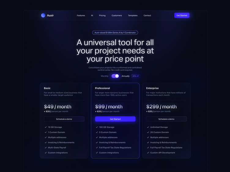
Here is one of the most interesting dark mode UI example:

Source: Dribbble

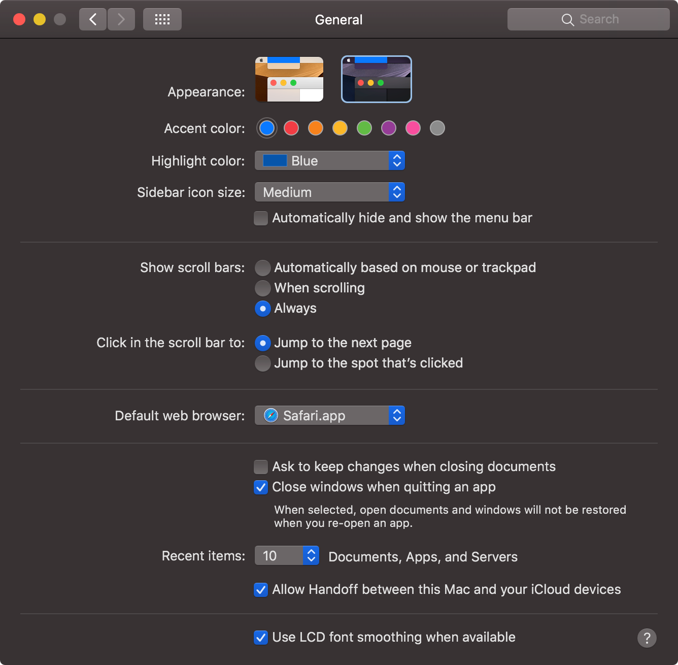
Source: Dark mode UX/UI in macOS system apps
Neumorphism
Neumorphism, also known as “soft UI,” focuses on creating a sense of tactility and depth in digital interfaces. Unlike the stark simplicity of flat design, Neumorphism introduces subtle shadows and highlights, giving elements a soft, almost extruded appearance.
Soft Shadows and Highlights
Neumorphic design relies heavily on soft shadows to lift elements from the background and create a three-dimensional effect. This delicate play of light and shadow enhances user engagement.
Minimal Color Palette
Neumorphism often employs a muted color palette, contributing to its understated and elegant look. Subtle variations in hue help highlight interactive elements.
Skeuomorphic Influences
While moving away from the realism of skeuomorphism, Neumorphism retains certain skeuomorphic elements, such as imitating the appearance of buttons or cards in the physical world.
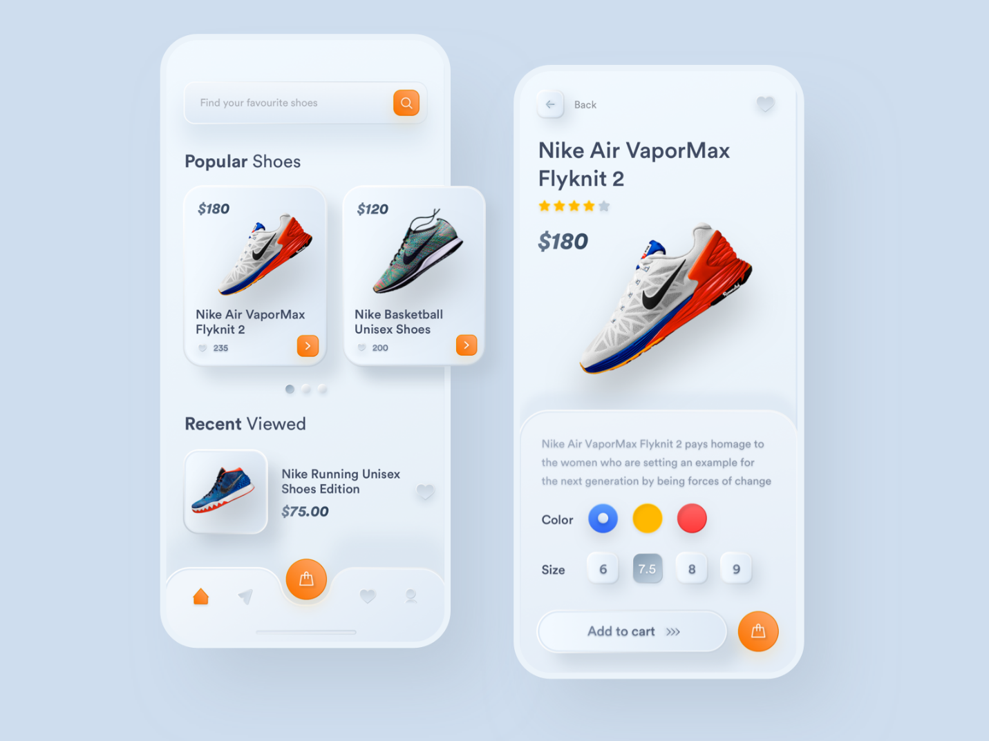
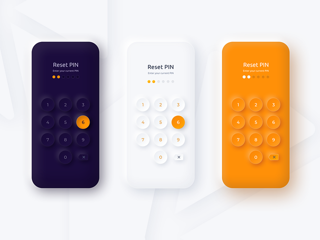
Neumorphism is one of the UI UX trends that has gained popularity in recent years. It’s a visual style that combines elements of skeuomorphism and flat design, aiming to create a digital interface that mimics the physical world while maintaining a modern aesthetic. Here are some of the Neumorphism UI UX examples:

Source: Nike Shoes E-Commerce Neumorphism

Source: Neumorghism 2
Glassmorphism
Glassmorphism is a UI UX design trend that emerged in 2024. It is characterized by design elements that have the appearance of translucent frosted glass. The design elements are layered, with objects appearing to float in space, and the top layer appearing to be part of the glass.
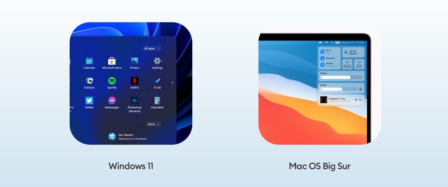
In 2020, Apple introduced Glassmorphism in macOS Big Sur. Two years later, this style was adopted by several graphics applications and websites, including Canva. Such events have further established the popularity of Glassmorphism among designers and have set new UI trends for 2024.

Glassmorphism in macOS Big Sur
Glassmorphism adds a touch of minimalism, modernity, sleekness, and a futuristic look to UI design. To achieve the desired effect, designers use a background blur and a translucent outline that mimics the edge of glass.
Here are the leading points of the Glassmorphism user interface design:
- Frosted glass appearance with translucent or transparent UI elements.
- Layered style for a 3D effect.
- Colored backgrounds that contrast with glass colors, creating a visible blur.
- Shadows added to layers for depth and a three-dimensional look.
- Border highlighting to define the shape of design elements.
Advanced Microinteractions
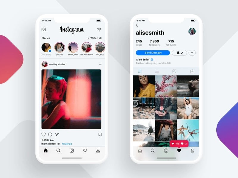
Microinteractions are small but crucial components of UI/UX design that can have a significant impact on the user experience. Skilled designers will prioritize creating meaningful microinteractions that offer immediate feedback, assist users in completing tasks, and add a touch of delight to the user journey by 2024. These tiny design elements can make a significant difference in user satisfaction.

Source: Instagram micro interaction UX/UI
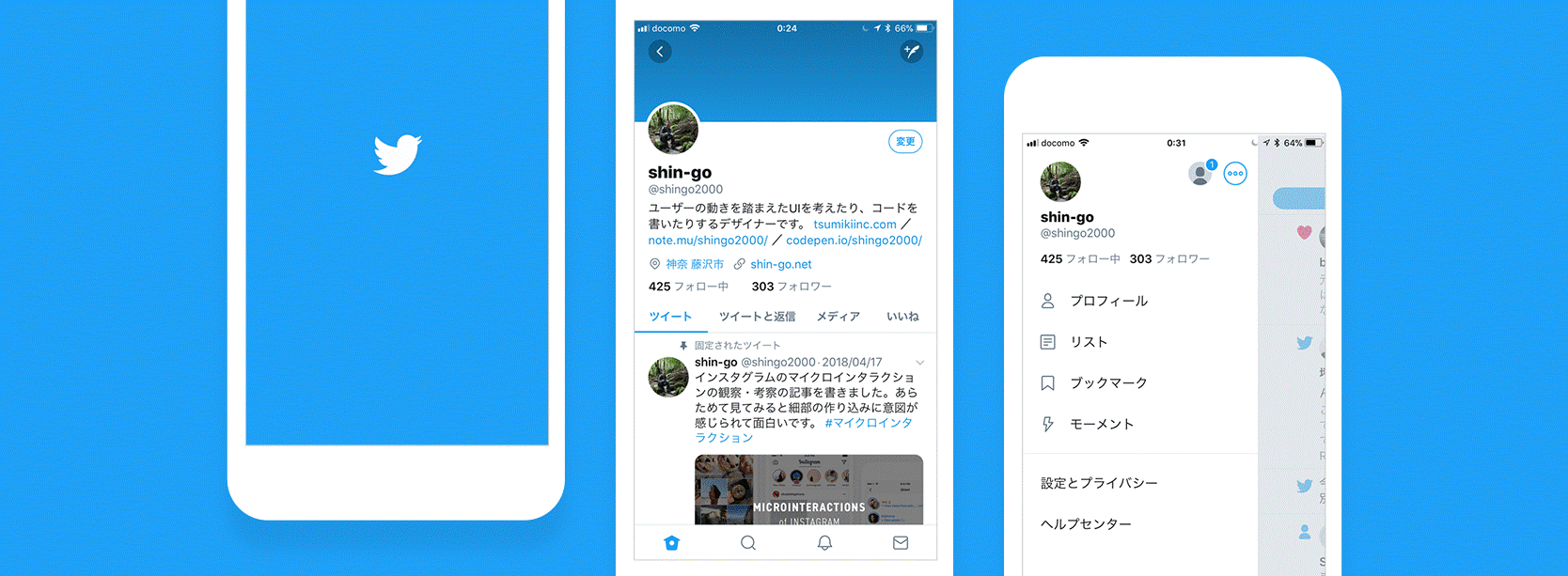
Micro-interactions are present in every software application, and we use them every time we interact with different applications. The “Like” feature of Instagram and the “Retweet” feature of Twitter are perfect examples of micro-interactions. Advanced micro-interactions such as gestures and touchless controls provide new opportunities for crafting a more intuitive experience. We can expect to see more of these advanced micro-interactions in 2023.

Source: Twitter micro interaction UX/UI
Typography
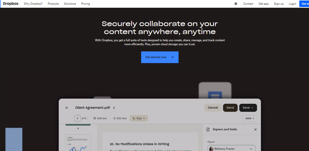
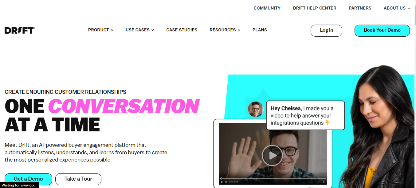
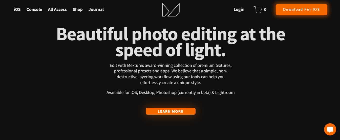
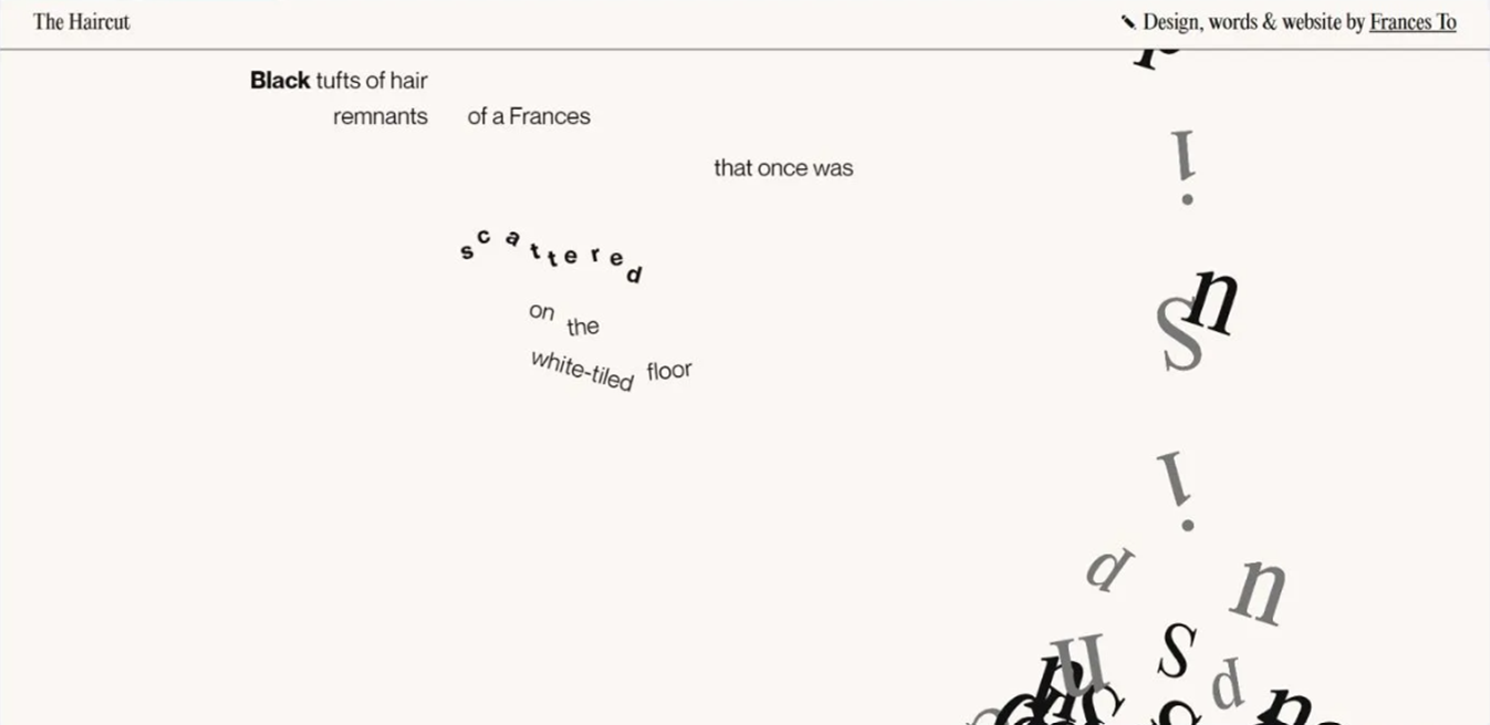
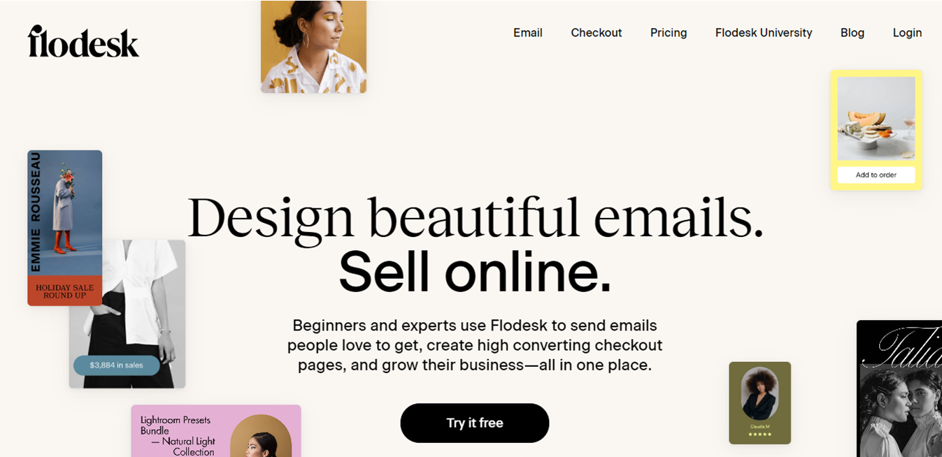
Have you noticed how web typography is evolving? It’s becoming bigger and bolder, especially for landing pages and microsites. Bold typography is an incredibly effective way to grab users’ attention. It stands out from its surroundings and demands to be read.
But it’s not just about being bold. It has to be an integral and integrated part of the overall aesthetic. Popular websites are already adopting this technique, and it looks like bold typography is here to stay. With a straightforward and proactive approach, it’s set to continue growing in 2024. Just take a look at the landing pages of Dropbox, Drift, and Mextures. They’re the perfect examples of how bold typography can make a real impact.

Soruce: Dropbox

Source: Drift

Source: Mextures
This section compiles various UI UX trends for 2024, each requiring individual attention to achieve unique designs for websites and other products.
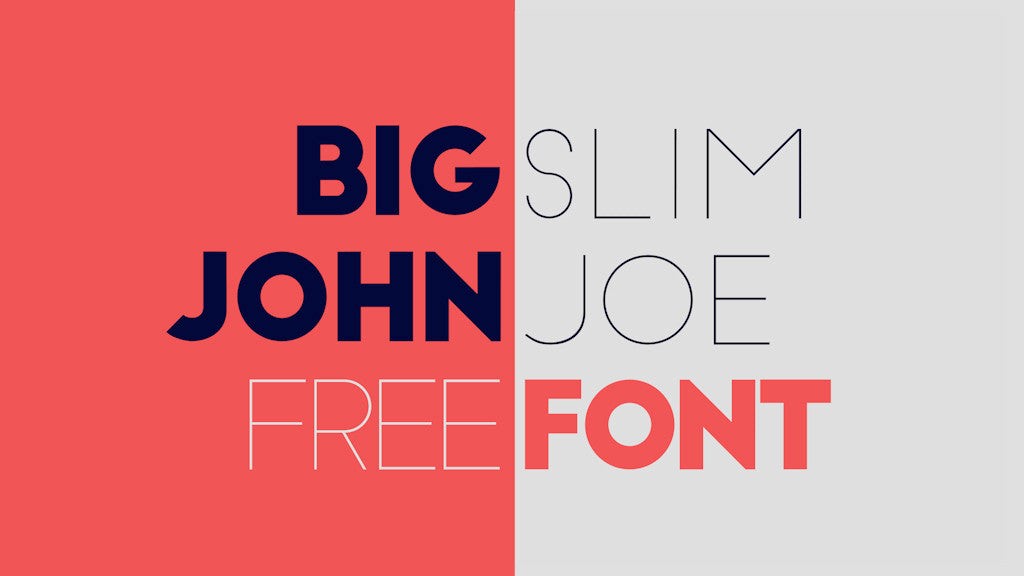
Oversized typography
Oversized typography is a great way to showcase the UI/UX design trend. You can use large headlines or typographic design to convey the essence of the brand to your clients. Sans serif fonts are commonly used in this context.
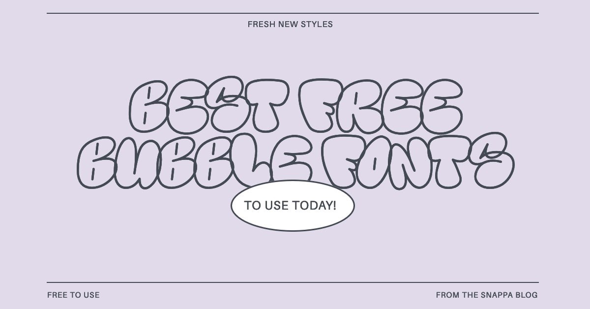
Bubble typography

Bubble typography is a trend that allows you to express your ideas not just in size, but also in form. It uses rounded and flowing shapes for UX/UI. The most popular trends in 2024 will be mercury and metallic fonts, but there is no limit to the freedom in this direction.
Retro typography

Retro typography uses bright and bold fonts with rounded shapes that resemble the logos of old institutions or their headlines.
Distorted fonts

Source
Distorted fonts are a bold solution suitable only in a context where you want to direct the user more towards the text itself, rather than the speed of reading it.
Mixing fonts

Source
Mixing fonts is a great way to combine and improve the expression and presentation of your own ideas. It helps to emphasize what’s important to focus on in UX/UI, keep up with current trends, and stay competitive.
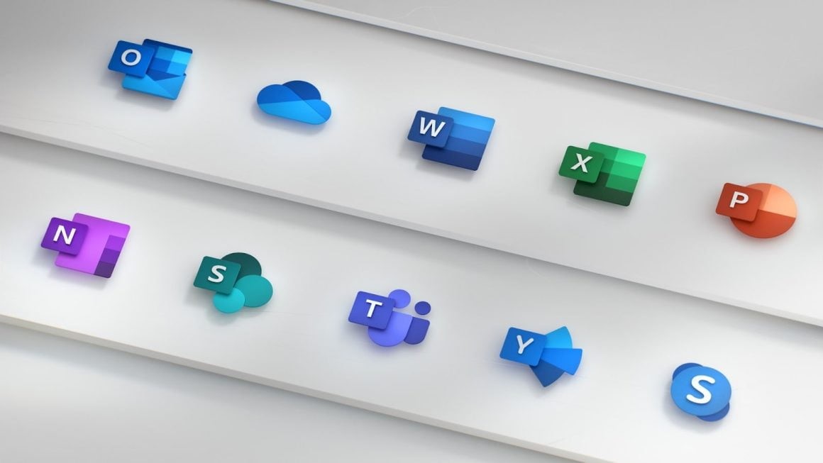
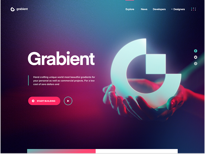
Smooth gradients

The use of smooth gradients in design is currently very popular. Major tech companies such as Microsoft, Apple, and Google have all incorporated gradient-based designs in their products. Microsoft’s fluent design system and Apple’s new design approach in macOS Big Sur are two examples of this trend. Google has also redesigned the logos of Gmail, Calendar, Drive, Docs, and Meet to feature gradients.

Source: Eddie Lobanovskiy
3D
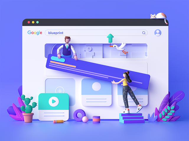
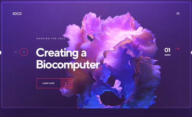
The use of 3D designs has been gaining popularity in both mobile and web applications despite some drawbacks on memory consumption. In 2024, the trend is expected to continue as 3D design elements add depth and interactivity to digital interfaces. Combining 3D design with minimalist principles can result in visually stunning and user-friendly interfaces. This combination allows for engaging user interactions while maintaining a clean and uncluttered design aesthetic.

Source: Blueprint – landing page

Soruce: IOCO / Biocomputer
With the rising popularity of AR VR Development , 3D elements are expected to thrive in 2024. Including 3D elements in design work can help visualize complex data, build the UX of a VR app, or enhance brand recognition. 3D elements draw the user’s eye and add depth and realism that draws users in. Although the origin of the trend is unknown, some designs resemble those created using Midjourney, another AI tool.
Design System
A Design System is a game-changer in UI/UX trends. It guarantees consistency in design elements, simplifies the development process, and enhances user familiarity. Embracing this trend is like laying a sturdy foundation for creating a digital masterpiece.
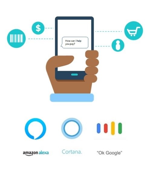
Voice User Interface (VUI) and Touchless Interactions

Source: chatbotsmagazine.com
Imagine talking to your device and getting an instant response – that’s the magic of Voice User Interface (VUI) and touchless interactions. This user interface and user experience trend is taking a huge leap into the future, allowing for more natural and hands-free interactions. The possibilities of VUI are expanding, from smart speakers to voice-controlled apps. It’s not just about technology; it’s about a conversation, a new language of user engagement that is changing the way we interact with digital interfaces.
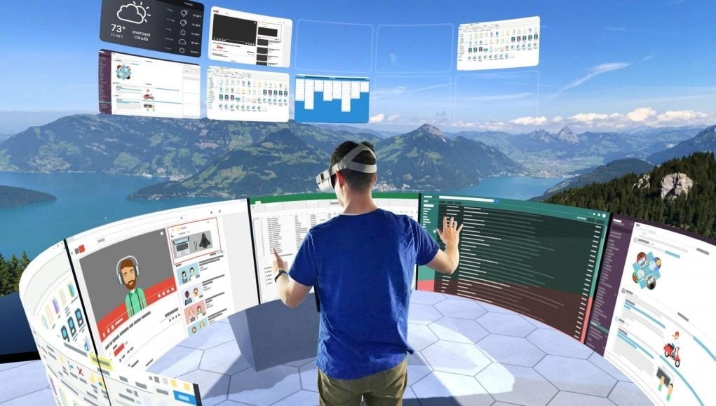
Augmented & Virtual Reality

Source: Road to VR
Enter the world of Augmented & Virtual Reality – a playground where reality and imagination dance together. This UI UX trend isn’t just about gaming; it’s about immersive experiences. From trying out furniture in your living room before buying it to exploring distant places from your sofa, AR and VR redefine how users engage with digital content. It’s not a trend; it’s a journey into uncharted digital territories.
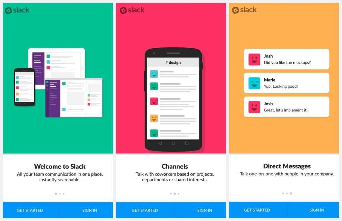
Great User Onboarding Experience

Source: Slack
Imagine a digital welcome mat rolled out just for you. This is the essence of a great user onboarding experience. In the landscape of UI/UX trends, the onboarding process is where first impressions bloom. An intuitive onboarding process guides users, making them feel at home in your digital space. It’s more than just a tutorial; it’s the warm handshake that invites users to explore and stay awhile.
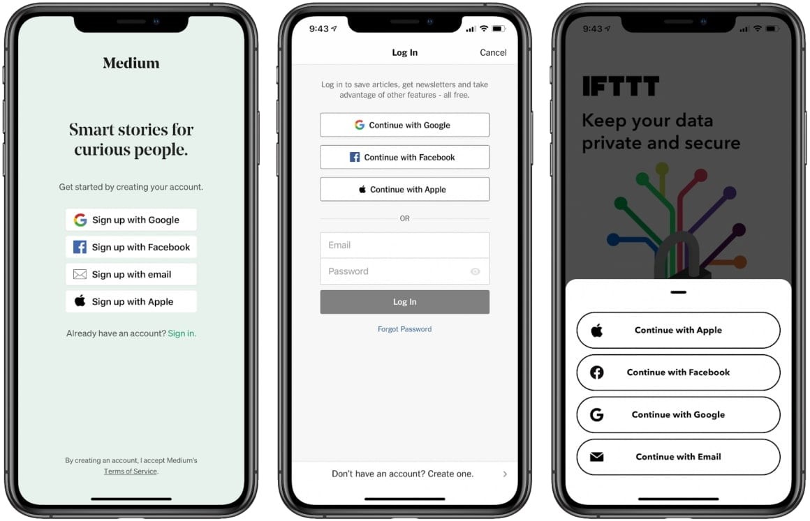
Frictionless Authentication

Source: MacRumors
Are you tired of struggling with complicated passwords every time you want to access your accounts? Well, say hello to a new era of authentication – the Frictionless Authentication! It’s all about making your login experience seamless, secure, and oh-so-easy. With UI UX trends like facial recognition and fingerprint scans, you can now log in with just a breeze. But it’s not just about staying safe – it’s also about enjoying a user-friendly digital journey, where security is an integral part. So, are you ready to ditch the hassle and embrace the simplicity of Frictionless Authentication?
UX Writing and Microcopy

In the universe of UI UX trends, every word matters. UX Writing and Microcopy ensure that communication is not just clear but delightful. It’s the art of condensing information into bite-sized, engaging snippets. From error messages that empathize to button texts that guide, UX writing is the unsung hero of a smooth digital experience.
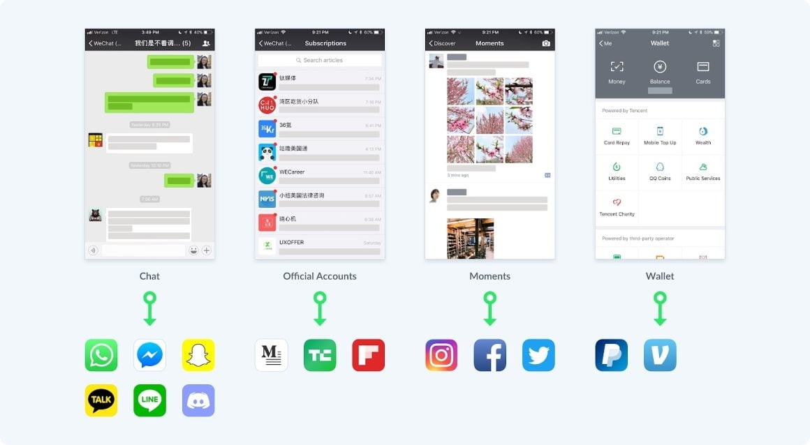
Rising of Super Apps

Source: Wechat
Enter the age of the Super App – your one-stop digital universe. This UI UX trend brings a multitude of services under a single umbrella, simplifying your digital life. From chatting with friends to ordering food and checking the weather, super apps redefine convenience. It’s not just an app; it’s an entire ecosystem at your fingertips.
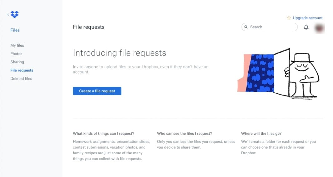
Empty and Error States Illustration
Empty and Error States Illustration is a helpful guide in UI/UX design. It helps users navigate through digital detours when things go wrong or when they encounter unfamiliar areas. These illustrations are important because they ensure that users never feel lost. Unexpected moments become opportunities for engagement with the help of these illustrations. They are not the main focus, but they play a crucial role in keeping users on track.
Why UX UI trends?
The use of 3D designs has been gaining popularity in both mobile and web applications despite some drawbacks on memory consumption. In 2024, the trend is expected to continue as 3D design elements add depth and interactivity to digital interfaces. Combining 3D design with minimalist principles can result in visually stunning and user-friendly interfaces. This combination allows for engaging user interactions while maintaining a clean and uncluttered design aesthetic. With the rising popularity of VR and AR technologies, 3D elements are expected to thrive in 2024.
Including 3D elements in design work can help visualize complex data, build the UX of a VR app, or enhance brand recognition. 3D elements draw the user’s eye and add depth and realism that draws users in. Although the origin of the trend is unknown, some designs resemble those created using Midjourney, another AI tool.
Technbrains has the best UI UX designers
Experience innovation at its peak with Technbrains—your gateway to the future of design! Our UI/UX trends pioneers redefine excellence, crafting interfaces that transcend expectations. Join us in shaping tomorrow’s digital landscape, where creativity meets cutting-edge technology. Elevate your digital experience with the best UI/UX designers leading the charge into the dynamic world of UI UX trends!

